Brand & Identity
When doing a logo, I’m always trying to have a bit of the brand’s story and emotion built into the final mark. I’ve had the good fortune to work with great people at some great brands who’ve trusted in the final result for their use.
Elements Calgary Mental Health Centre
Client: Elements Calgary Mental Health Centre
The name Elements is a reflection of the former Calgary Association of Self Help, a great organization devoted to helping those living with mental illness grow and manage their disease. This logo symbolizes the many elements of care that come together to support the clients in their recovery and management of their disease.
Aria Solutions
Agency: Rebox – A B2B Brand Distillery
Aria Solutions needed an identity refresh that would tell their customers that they were experts at facilitating conversations between their clients and customers. After a couple false starts, we landed on a solution that was both playful and energetic and started a conversation. The rebranding efforts would lead to Aria Solutions being acquired within a year of the brand launch.
RockSolid Building Products
Agency: Rebox – A B2B Brand Distillery
Rocksolid Building Products is a new subsidiary company of EcoHom, serving the construction industry in Alberta. They are bringing alternative non-structural building materials to market that are more popular in Europe, like AirCrete and HempCrete. The logo evokes an internal floor plan that AirCrete walls can be used for.
EcoHom Commercialization and Design Consultancy
Agency: Rebox – A B2B Brand Distillery
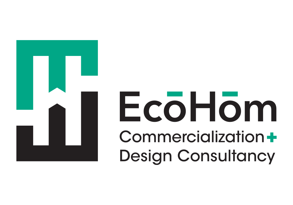
EcoHom is a company looking to change how commercial and residential structures are designed and built in Canada. They bring together new technology, processes and methods for greater sustainability and development. Two E’s help create a fun H in the negative space, making a mark in the industry.
Rain Cage
Agency: Rebox – A B2B Brand Distillery
Rain Cage is a company focused on bridging the technology of tomorrow with the needs of today. This brand identity is a fleshing out of their original look that had the name and the corner brackets, meant to show the value they add amongst their core industries.
NOW Wealth Management Solutions
Agency: Rebox – A B2B Brand Distillery
As a new part of the Raymond James family, NOW Wealth Management Solutions needed a logo that was distinct in the wealth management space, but would work with Raymond James as a co-brand. This is the second iteration that won the day.
Donald J. Wilson Services
Client: Donald J Wilson Services Ltd.
A family business located in Drumheller, Donald J. Wilson Services offered both oilfield management services while being a go-to spot for auto-detailing in town. The Double U is a reflection of these aspects, with the bright red being a nod to the owner’s love of the Calgary Flames.
Kneehill Agriculture
Agency: Rebox – A B2B Brand Distillery
Kneehill Agriculture is a new Hutterite farming operation starting up in Kneehill County, Alberta. As they are a new farm, they wanted to have a more traditional look and feel for their identity, one that would work to instil trust with the viewer. We utilized stock assets for the tractor and wheat and built out the word mark to meet the client’s tight budgetary constraints.
Absolute Value Publications (unused)
Agency: Rebox – A B2B Brand Distillery
An unused concept for a publisher of math workbooks and guides. Combining a classical Varsity-type font with a checkmark helped tied the company’s initials with what they did. A personal favourite, I’m sorry it never went forward.
Calgary TELUS Convention Centre (unused)
Agency: Rebox – A B2B Brand Distillery
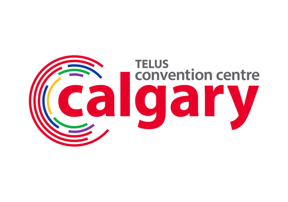
An unused exploration for an updated logo for Calgary TELUS Convention Centre. The final version would have incorporated the cities “be part of the energy” phrasing. This was meant to show a more modern presentation, with everything coming together “At the Centre.” The tagline was the only thing that went forward.
